Access is asserted
in a table. It is
experienced as a drive.
The population beyond the standard that actually applies in this county — measured live on the road network from population-weighted origins, with the threshold itself movable. And the reading nobody publishes: whether the compliance rests on a granted exception.
Whether to accept a compliance number — or contest it.
A county board reading a closure notice under SB 1300. A health centre choosing where the next clinic goes. An advocate reading a plan's network filing. And the plan's own analyst, doing a pre-check before the filing is made. Four readers, one question: for this service line and the standard that actually applies here, how many people are outside it — and where are they?
Every incumbent answers a different question — does this plan's network pass? The buyer we serve is often the person on the other side of that filing, which is why the arithmetic has to be open and the threshold has to move.
Trinity County, Medi-Cal primary care, 10 mi / 30 min: 35.1 % outside from population-anchored origins — 100 % outside from tract internal points.
A county whose seat has a general acute care hospital in town. Measured live on OSRM, 2026-08-23 — identical to the 2026-07-29 reading, to the decimal.
Three modelling choices decide the answer. All three are normally invisible.
The threshold
A single number — 10 miles, 30 minutes — quietly decides everything downstream. The 2SFCA literature names the failure precisely: fixed thresholds produce abrupt discontinuities, and a resident just past the boundary is excluded from a facility they can see.
The origin
TIGER internal points are geometric, not population-weighted. In a large rural tract the point can land on a ridge 37 miles from the town where everybody lives — and the deficit that follows is a modelling artefact wearing the clothes of geography.
The exception
DHCS grants alternative access standards at scale. A reading that renders a county "compliant" without saying whether that compliance rests on a granted exception is reporting the paperwork, not the access.
So the app puts all three on screen and makes them movable: drag the rule, name the origin policy, toggle the exception — and every number carries the authority that produced it.
The tools that measure against a standard don't let you move it.
| What exists | The question it answers | The threshold | Verdict |
|---|---|---|---|
| Quest Enterprise Services | does this plan's network pass? — 400+ plans including all eight of the largest; CMS contract extended 27 Jan 2026 | fixed by the regulator's template | The certification layer — excellent, and we do not compete with it |
| Esri Access to Care | a capability stack — Pro, Business Analyst, Network Analyst, a GeoAnalytics hexagon job | whatever the analyst types | Tooling run by an analyst, not a solution app |
| UDS Mapper · PolicyMap · CDC PLACES · County Health Rankings | an indicator on a geography | none — no road network anywhere in the reading | Excellent reference maps. None reads a population beyond a rule |
| 2SFCA / E2SFCA | a composite accessibility score | a fixed catchment — and it is the documented weakness | The method. We report a measured quantity instead of a score |
| Who's Outside | how many people are beyond this standard, who they are, and what a closure does to it | the rule is the navigation | The gap |
Access is asserted in a compliance table and experienced as a drive, and no public instrument reconciles the two. The table is a private regulatory artefact; the drive is measurable from open data; nobody publishes the difference.
The navigation is a distribution, not a map.
The buyer's question is a quantity relative to a threshold. So the app navigates by a cumulative coverage curve with the statutory rule drawn on it, and the protagonist is the mass of population on the far side. The map is demoted to an evidence pane — it says where, once the curve has said how many.
Drag the rule with the pointer, or focus it and use the arrow keys — 1 min a press, 5 on Page Up/Down. The deficit KPI, the map's verdict colours, the cohort list and the evidence strip all move in the same frame, because they are one function evaluated at one x.
Everything needed to defend the number is on screen.
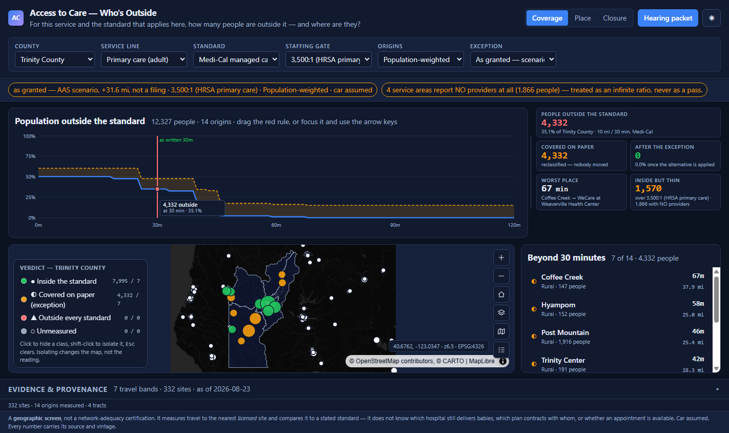
- Six pickers, in the header. County · service line · standard · staffing gate · origin policy · exception. Every one of them deep-links.
- A persistent notice bar. The reading in force, in words — "as granted — AAS scenario, +31.6 mi, not a filing" — beside the service areas with no providers at all, treated as an infinite ratio and never as a pass.
- The deficit leads. 4,332 people, 35.1 % of Trinity County, against a named standard and its authority.
- The legend filters, and counts. Click hides a class, shift-click isolates, Esc unwinds one thing at a time. Every denominator is kept — 4,332 / 7.
- The cohort list names them. Coffee Creek 67 min · Hyampom 58 · Post Mountain 46 — places, populations and measured drives, not a shaded polygon.
An origin point is a modelling choice, not geography.
Census internal points are TIGER's geometric centres. Measured live on the road network, in one Trinity County tract:
tract 06105000102 internal point → the same hospital 152.5 min · 36.8 mi
that tract holds 3,879 people
⇒ from internal points, 100 % of Trinity's 12,327 residents fall outside both the 30-minute and the 10-mile Medi-Cal standard
⇒ in a county whose seat has a general acute care hospital in town
Blast radius: 267 California tracts are 100 sq mi or larger, holding 836,798 people — 2.2 % of the state. So origins are population-weighted by default, and the internal-point policy is offered only with a badge on every number it emits.
This is the finding the app exists to make. Not that Trinity is underserved — that a 65-point swing hides inside an unexamined default, and no incumbent shows you which one it used.
"As written" and "as granted" are different maps of the same county.
DHCS publishes time-and-distance standards and grants exceptions to them at scale. The National Health Law Program's analysis (31 July 2019) found roughly 10,000 new alternative access standard requests approved in January 2019 alone, raising the required provider distance by a mean of +31.61 miles. Paediatric providers were nearly three-quarters of approvals. Low-income areas received more approvals, with larger distance increases, than high-income ones.
outside as written 4,332 people · 35.1 %
apply the documented mean AAS +31.61 mi
outside as granted 0 people · 0.0 %
people who moved 0 · drive times byte-identical
So the band is called covered on paper
Not "compliant", and not green. All 4,332 are reclassified into a band that names the mechanism in words, at exactly the same measured drive. A colour alone would let a reader mistake an exception for access.
And it is labelled a scenario
DHCS publishes no machine-readable AAS docket. So "as granted" is either a labelled scenario at the published mean, or a filing the reader supplies — never a fact about a county. The notice bar says so, and the packet repeats it.
An exception erases a deficit without moving anyone. That sentence is the whole product, and it is unreadable in any tool that reports a single compliance verdict.
What does closing this unit do to the drive?
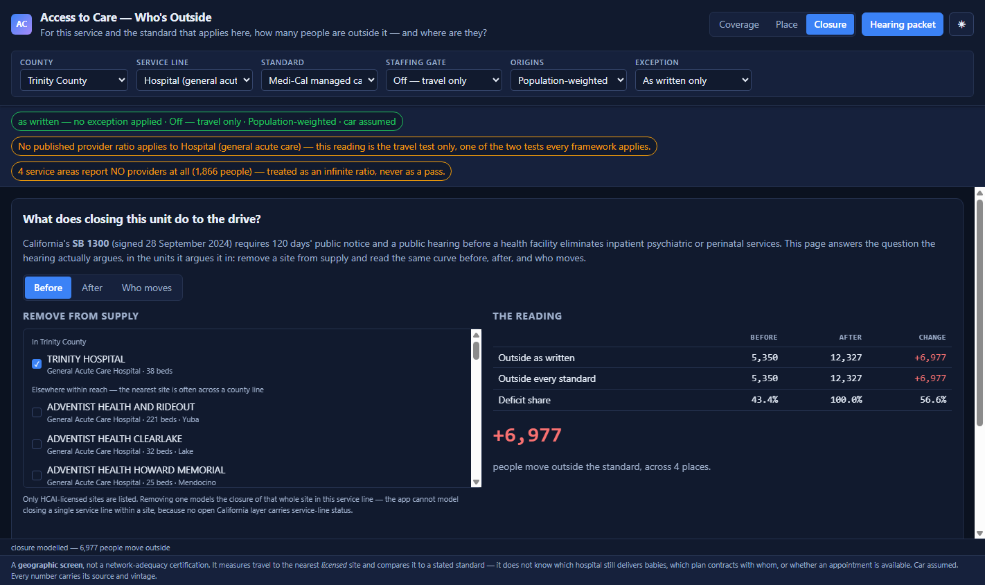
SB 1300, signed 28 September 2024, requires 120 days' public notice and a public hearing before a facility eliminates inpatient psychiatric or perinatal services. This page answers the question that hearing argues, in the units it argues it in.
And when a closure crosses no threshold, it still reports who drives further. Closing Trinity Hospital does not move the primary-care curve — the WeCare health centre in Weaverville remains. Reporting only threshold crossings would call an added hour "no impact".
Seven services. Six traps that decide the number.
OBJECTID is never the OID
objectIdFieldName is absent on all seven bound layers. The real OID is ObjectId or FID — and the shortage-area layer carries a different column literally named OBJECTID. Assume it and you highlight the wrong feature, silently.
AREA_SQMI is a String
A naive orderBy returns 99.21 as California's largest tract; the truth is 982.13. > 100 errors HTTP 400. Cast to float and you get the 267 tracts that set the blast radius of the origin trap.
The state's own join is broken
The 2024 MSSA redefinition renumbered the geography; the 2020 shortage layer was never re-cut. Exact key overlap: 6 of 542. Name overlap: zero. Designations are joined spatially, and both vintages print beside the score.
The birthing flag is a 2021 fossil
257 facilities carry it; the newest licence expiry in the whole layer is 2021-11-15. Meanwhile 56 California maternity wards have closed since 2012 and Corona Regional ended L&D on 30 Jan 2026. The obstetric line ships behind a verify badge, never as current availability.
The ids channel and the feature channel page differently
returnIdsOnly for 5,000 rows returns 5,000 ids; asking for 5,000 features returns exactly maxRecordCount. Page on the ids figure and you truncate a county without an error.
The standard itself is not machine-readable
dhcs.ca.gov returns 403 to a machine fetch of the per-county attachment — re-confirmed 2026-08-23. The statewide default ships with its authority printed beside it; a county-specific threshold is transcribed in a browser and entered by hand. The app says so, on screen and in the packet.
The spine: 10,961 HCAI-licensed facilities · 9,106 tracts → 542 Medical Service Study Areas, 268 of them designated Primary Care Shortage Areas · 3,047 California health-centre sites · 180 California primary-care HPSAs · CDC PLACES model-based prevalence, always rendered with its 95 % interval · OSRM on OpenStreetMap for every travel figure. Σ tract population 38,589,882 — three tract universes reconciled by GEOID and reported, never silently joined.
Built, driven and measured — 2026-08-23.
Only the screenshot caught it
The headline KPI showed a green 0 on first paint — the exception is on by default, so the app led with the figure that survives it. A county with 4,332 people outside, its own argument invisible, with 86 assertions green. The headline is now the deficit as written.
Nothing is silently capped
A county over 200 origins measures the largest-population ones first and prints "measured 200 of 364 — 70 % of the county's people" on screen and in the packet, with a measure all button. A capped run that looked complete would be the worst thing this app could ship.
Absence is never coloured as coverage
A tract the prevalence model does not cover renders "no estimate", never zero. A service area reporting no providers at all is an infinite ratio, never a pass. An origin with no route is unmeasured, never inside.
Reading the figures: every number on these slides is computed by the shipped app from live public services on the dates named. There is no generated data anywhere in this build — where a source does not exist, the lane renders empty with its citation rather than being synthesised.
What this application will not do.
- A geographic screen, never a certification. Not a measure of any plan's contracted network, not a provider directory, not a legal determination on adequacy or designation.
- It does not know which hospital still delivers babies. No open California layer carries service-line status. The one mapped birthing indicator is a 2021 licence snapshot, and it ships badged.
- Not an appointment-availability or wait-time measure, and not an ambulance response model — neither response zones nor unit counts are in open statewide data.
- Car assumed, on every number. Free-flow travel from a community OSM router with an unstated vintage: a floor, not a lived journey. Vehicle availability is not wired.
- "As granted" is a scenario, not a docket. No machine-readable exception register exists, so it is the published mean or a filing the reader supplies — never a fact about a county.
- Per-county thresholds are not bundled. The source PDF refuses a machine fetch; a county-specific number is transcribed by hand, and until then the statewide default shows with its authority.
- Read-only, end to end. No write path anywhere, so it runs identically on Strata Serve and on ArcGIS. A county's own verification notes would need a writable backend.
- English only, and no batch atlas. One language, no RTL surface in this build; the hearing packet is the one composed export.
Every one of these is written into the delivered application's own README. A tool that hides its edges costs you the project it cannot finish.
One supply set.
One standard you must meet.
Your licensed sites or your contracted roster as the supply set, the threshold that binds you with its authority, and a population layer with a settlement geography. Two weeks, and this curve reads your service area instead of a California county.
Swappable by configuration, not by code: the reporting geography, the service lines, the standards table and the routing engine. No threshold, unit or authority is hardcoded to a California rule — the app renders a typology of standards, not a list of US numbers. And a plan that already owns a certification platform should push its own roster in and see what its certified network looks like as a distribution.